Strong Space
Brand identity for a private gym based in Shoreditch, London, offering one-to-one strength training and conditioning
Brand Identity Design

Based in Shoreditch, Strong Space serves Londoners looking to receive
one-to-one strength training and expert advice. While recent trends have developed in the fitness industry to hit the gym for reasons other than to change one’s physical appearance (e.g. to improve one’s mental health), there are still many people who want to train specifically to grow muscle. Strong Space recognises this, and offers clients a tailored approach towards building muscle that caters for each person’s unique body frame and default genetics.
With 40 years of experience that encompasses boxing, bodybuilding, powerlifting and CrossFit, founder of Strong Space James Clarke has developed a holistic approach towards helping people lose fat and gain muscle. Strong Space offers clients a specific program that consists not only of physical training such as bodybuilding, strength, conditioning and power-lifting, but also emphasises the importance of tracking one’s macro-nutrient intake.
Recently listed as one of London’s top ‘trendiest’ places to live by Really Moving, Shoreditch is at the epicentre of the creative and tech industries in the UK. Given this context, it was vital that the Strong Space visual identity reflected the area’s unique culture. The brand identity Alice Jones Design Studio developed is therefore contemporary and minimal, yet vibrant.
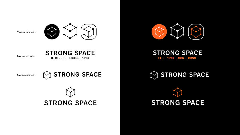
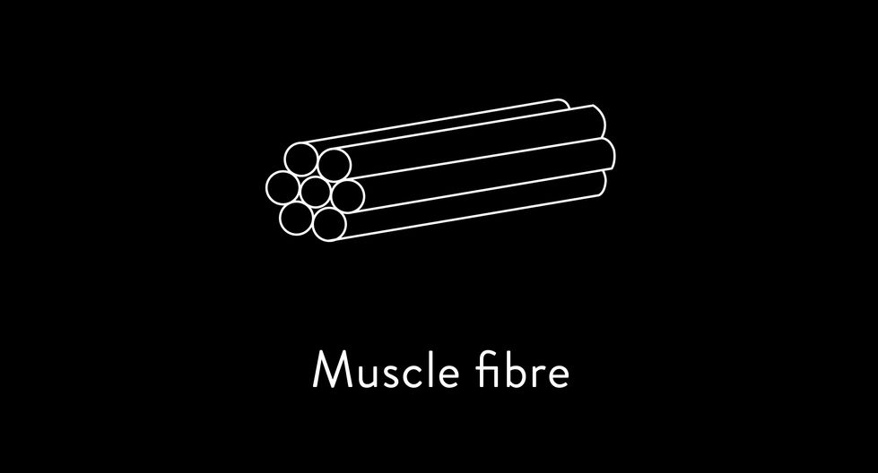
The Strong Space logo reflects the meticulous nature of James Clarke’s approach towards helping his clients transform their physique. Inspiration for the logo was derived from research into scientific representations of muscle strands. The
Z-disk acts as the border of the sarcomere found in the myofibrils of muscle fibres. This is represented by a particularly striking visual diagram, and was therefore integrated into the final logo. The Z-disk diagram was simplified into a box-like shape that is simultaneously representative of the idea of a ‘strong space’.
To complement the distinctive logo, the Strong Space visual identity employs
a bold colour palette consisting of black, orange and white. The austere quality of this colour combination reflects the dedicated attitude of the Strong Space brand. For print and digital application, the brand identity adopts a spacious approach towards layout. In tandem with the use of a bold colour palette and
a minimal layout approach, Nort is a typeface with an ascetic tone. Together, these brand elements combine to create a visual identity that is confident,
serious and modern.


